Experimental Psychology (Russia)
2025. Vol. 18, no. 1, 108–118
doi:10.17759/exppsy.2025180107
ISSN: 2072-7593 / 2311-7036 (online)
Typographical characteristics and processing of Latin and Cyrillic words
Abstract
Context and relevance. The main goal of this study is to examine the typography effect in the Serbian language. Typography refers to the way letters, words, and sentences are placed on a page. The correct use of typographic features can significantly improve the readability of the text and facilitate its processing. Bolding and spacing are often used to emphasize important parts of the text, while letter spacing is also used to increase the readability and visual appeal of the text. Objective. In this research, we want to examine how the mentioned typographical characteristics affect the speed of word processing in the Serbian language, given that it uses two alphabets - Latin and Cyrillic. Methods and materials. The research was conducted on 143 subjects, students of the University of Banja Luka who individually participated in the experiment. Results. The results show that bolding words can improve processing time, and such an effect is present in both alphabets. On the other hand, letter spacing has a positive effect only in Latin. Conclusions. These insights can be useful for designing better typographic solutions in school textbooks and other text materials to facilitate the process of reading and understanding the text in both alphabets.
General Information
Keywords: typography, bolding, letter spacing, Latin, Cyrillic, processing time
Journal rubric: Psycholinguistics
Article type: scientific article
DOI: https://doi.org/10.17759/exppsy.2025180107
Received: 12.01.2024
Accepted:
For citation: Romić M., Borojević C. Typographical characteristics and processing of Latin and Cyrillic words. Eksperimental'naâ psihologiâ = Experimental Psychology (Russia), 2025. Vol. 18, no. 1, pp. 108–118. DOI: 10.17759/exppsy.2025180107.
Full text
Introduction
Numerous studies have been conducted in recent years on the importance of typographic elements, particularly with the rise of digital forms of communication and the necessity to adapt texts as much as possible to readers. However, research using printed forms have also demonstrated that the presentation of the information affects processing and interpretation. The placement of letters, words, and phrases on a page is referred to as typography (Blackwell, 2019). It encompasses letter styles, appearances, and structures that appeal to the reader's emotions and effectively transmit the text's message. Fonts, letter size, letter spacing, text and background colors, bold, italic, underline, and other styles are examples of typographic features. It has been demonstrated that the proper application of certain typographic elements can greatly increase the text's readability and make it easier to process (Pelesek, 2018). These traits have an impact on the message being sent, and their usefulness is shown in improving the text's quality (Finkebeier, 2021; Hagemann, 2013; Hyndman, 2016; Jaderberg, Vedaldi, Zisserman, 2014). According to research by Macaya and Perea (2014), bolding makes it easier for readers to recognize words visually, and Yingying, Zhenxing, Wanru, Zengyan, and Rong (2002) found that any form of visual highlighting encourages readers to make more complex connections between visually highlighted information and related content when integrating it later. Certain authors emphasize the role of typography in solving the problem of multiculturalism, especially in the design of typographic signs for composing multilingual texts (Balius, 2013). According to research, certain fonts, including Arial, Helvetica, or Verdana, are well known for being readable. The font size is also important, so it is recommended that it be 10 and 12 for printed materials and 16 and 18 for digital formats. The readability and simplicity of text navigation are also impacted by line spacing, text width, and letter spacing (Blackwell, 2019). Additionally, reading is made simpler and the letters are easier to discern when there is a high contrast between the letters and the background (Blackwell, 2019; Jarosch et al., 2017). According to research (Thiessen et al., 2020), longer and more challenging texts likely to influence performance because they demand higher cognitive load during discrimination and long-term processing and increase reading time.
The role of typographic features has been the subject of numerous studies in recent years, especially with the development of digital forms of communication and the need to adapt texts as much as possible to readers. However, studies conducted on printed forms have also shown that the way the text is presented has an impact on processing and understanding. Typography refers to the way letters, words, and sentences are placed on a page (Blackwell, 2019). It includes the style, appearance, and structure of letters that evoke certain emotions in the reader and convey the meaning of the text in the right way. Typographic features include fonts, letter size, letter spacing, text and background color, bold, italic, underline, and other styles. It has been established that the correct use of these typographic features can significantly improve the readability of the text and facilitate its processing (Pelesek, 2018). These characteristics have an impact on the meaning of the message being transmitted, and their functionality is also reflected in improving the quality of the text itself (Finkebeier, 2021; Hagemann, 2013; Hyndman, 2016; Jaderberg, Vedaldi, Zisserman, 2014). It was found that bolding facilitates the process of visual word recognition (Macaya, Perea, 2014), and any visual highlighting of information helps readers make faster and more elaborate connections between visually highlighted information and related content in later integration (Yingying et al., 2021). Certain authors emphasize the role of typography in solving the problem of multiculturalism, especially in the design of typographic signs for composing multilingual texts (Balius, 2013). Research shows that certain fonts are known for their legibility such as Arial, Helvetica, or Verdana. The font size is also important, so it is recommended that it be 10 and 12 for printed materials and 16 and 18 for digital formats. In addition, line spacing, text width, and letter spacing affect the readability and ease of following text (Blackwell, 2019). Also, high contrast between the letters and the background allows the letters to be more clearly distinguished and makes reading easier (Blackwell, 2019; Jarosch et al., 2017). It was found that more difficult-to-read texts tend to affect performance because they increase the cognitive load in discrimination and long-term processing, and lead to an increase in reading time (Thiessen et al., 2020).
Serbian language has a unique feature called digraphia, which involves the equal use of two alphabets - Cyrillic and Latin. Both are taught during formal school education. In addition to the common properties related to the number of letters they are made of and the correspondence between graphemes and phonemes, there are also certain differences between the mentioned letters. They primarily refer to the visual identity of individual letters, which represent unique Cyrillic (Б, Ц, Ч, Ћ, Д, Џ, Ђ, Ф, Г, Х, И, Л, Љ, П, Ш, У, З, Ж) and unique Latin letters (Č, Ć, D, Đ, F, G, I, L, N, R, S, Š, U, V, Z, Ž), and previous research shows that there are also certain differences in speed processing Latin and Cyrillic words (Pašić, 2004; Borojević et al., 2018). Two studies have explored the impact of typographical features on Serbian language processing. In one study, researchers investigated the effect of font type on word processing in two alphabets. The results indicate that uppercase Cyrillic letters are processed faster when written in Times New Roman font compared to Arial font, while lowercase letters show the opposite effect (Tešinović, Borojević, & Dimitrijević, 2022). Another study focused on the use of italics to enhance text comprehension. While this feature was found to be effective in the Latin alphabet, it made the processing and identification of Cyrillic letters and words more difficult (Borojević & Vračar, 2023).
Our research aims to delve deeper into typography in the Serbian language. By doing so, we can gain new insights into how words are processed with the two alphabets in Serbian language. Through this study, we can determine the factors that can speed up processing, and whether they have the same effect in Latin and Cyrillic. It will greatly aid in understanding the process of perception of the alphabet, and in turn, the language. With the written text being ubiquitous in our daily lives, this research has significant practical implications as it allows for optimal use of our perceptual and cognitive systems. The research was conducted through two experiments. The first examined the effect of bolding on the processing speed of Latin and Cyrillic words, while the second focused on the effect of spacing between letters on processing time.
Experiment 1
The main goal of this experiment was to examine the effect of bolding on the processing speed of words written in Latin and Cyrillic. Bolding is often used to emphasize important parts of the text, which helps to identify key information faster (Pelesek, 2018; Baldwin, 2019), so it is expected that such an effect will be obtained in the Latin and Cyrillic alphabet of Serbian language.
Materials and methods
Participants
The experiment was conducted on a total of 75 subjects, students of the University of Banja Luka. They were randomly assigned to groups that did different experiments. Students who are fluent in reading Latin and Cyrillic letters, according to their subjective assessment, and who have normal or corrected-to-normal vision were selected.
Design and procedure
The design of this research is factorial. There are three factors: alphabet (Latin and Cyrillic), bolding (bolded words and normal words), and lexicality (word and pseudoword). The first two factors are between-subject factors and the third factor is within-subject factor. The dependent variable is reaction time. The experiment is carried out on a computer using software for creating psychological instruments SuperLab 4.5 for Windows. The research is conducted at the Faculty of Philosophy, through individual experiments. A lexical decision task was used, in which subjects were exposed to strings of letters, and their task was to answer whether the string of letters represented a word or a pseudoword by pressing the appropriate key. First, a fixation point is shown in the center of the screen, after which a string of letters is shown in the same position. The respondents voluntarily participated in the experiment, and verbal consent was obtained for participation.
Material
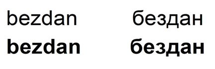
The stimuli were 60 nouns in the masculine gender with a length of 6 letters and 60 pseudowords of the same length. All words were written in small letters, size 48, Arial Font. The presentation method was varied so that one part of the stimulus was written normally, while the other part was in bold. (Examples of stimuli are shown in fig. 1).
Results
Considering the existence of a certain number of extreme values and the deviation of the data distribution from the normal distribution, data normalization, and logarithmic transformation of the dependent variable were performed. Table 1 shows the descriptive measures for the dependent variable in relation to the varied factors in the experiment. All analyses were performed for correct responses only. To determine whether these differences are statistically significant, a three-factor analysis of variance was applied. Post hoc analysis with a Bonferroni correction was performed. In addition to statistical significance, we also determined the size of the influence (effect size) through the partial eta square (ηp2). This parameter is proportional to the part of the variance of the dependent variable that is explained by the independent variable. Values range from 0 to 1, with higher values indicating a stronger effect of the independent variable. We used SPSS software for these analyses. Results are presented in Table 2.
Table 1
Descriptive statistics for reaction time in relation to varied factors
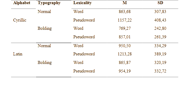
Table 2
Results of analysis of variance
|
Factor |
F |
df |
P |
ηp2
|
|
Lexicality |
634,18 |
1 |
,000 |
,073 |
|
Alphabet |
134,01 |
1 |
,007 |
,016 |
|
Bolding |
644,58 |
1 |
,000 |
,074 |
|
Alphabet*Lexicality |
1077 |
1 |
,299 |
,000 |
|
Bolding*Lexicality |
170,97 |
1 |
,002 |
,021 |
|
Alphabet*Bolding |
3,063 |
1 |
,080 |
,000 |
|
Alphabet*Bolding*Lexicality |
1,162 |
1 |
,281 |
,000 |
The main effect of lexicality on processing speed in the experimental task was determined. As might be expected, pseudowords are processed more slowly than words. This factor explains 7,3% of the variance in total reaction time. The main effect of the letter was also determined, but the percentage of explained variance was lower (1,6%). Words written in Cyrillic are processed faster than words written in Latin. Finally, the effect of bolding also reaches statistical significance and this factor explains 7,4% of the variance of the total reaction time. Bolding led to faster processing compared to normally written words and pseudowords. The results also show that there is a statistically significant interaction between lexicality and bolding. The use of this typographic feature led to the facilitation of responses in the lexical decision task. However, the difference in reaction time in relation to the way of presentation is greater for pseudowords (278,03 ms (95% CI, 256,15 ms — 299,91ms), p < ,001) than for words (87,19 ms (95% CI, 68,44 ms — 105,95 ms), p < ,001) (fig. 2).
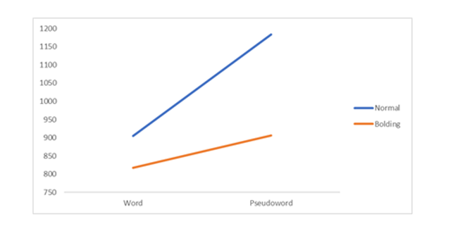
The obtained results confirm the initial hypothesis according to which a positive effect of bolding as a typographic feature on the speed of word processing in Serbian language is expected. This effect is observed in both Latin and Cyrillic alphabets.
Experiment 2
The main goal of this experiment is to examine the effect of spacing between letters on the processing of Latin and Cyrillic words. Previous research in other languages has shown that this typographic feature can improve text tracking and help the reader to distinguish between individual letters more clearly and facilitate the reading process (Pelesek, 2018; Baldwin, 2019). The starting hypothesis is that this type of visual presentation will increase efficiency in the task, that is, facilitate word processing when it comes to letters in the Serbian language.
The design and procedure were the same as in Experiment 1. A new group of 68 subjects were selected and randomly assigned experimental conditions. Stimuli were words and pseudowords written normally and with spaces between letters.
Results
Same statistical analysis was used as in the first experiment. Data validation was performed first. The existence of a certain number of extreme values and the deviation of the data distribution from the normal distribution were determined, so the data were normalized and the logarithmic transformation of the dependent variable was performed. After that, the procedures of descriptive statistical analysis and analysis of variance were applied to test the statistical significance of the differences regarding the dependent variable in relation to the varied factors.
Table 3 shows descriptive statistical measures for reaction time in relation to lexicality, letter, and spacing as typographical characteristics. The results show that the shortest reaction time was obtained for Cyrillic words written in normal letters, while the longest reaction time was observed for normally written Latin pseudowords. In order to check the statistical significance of the obtained differences, we applied a three-factor analysis of variance. The results are presented in Table 4.
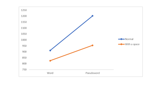
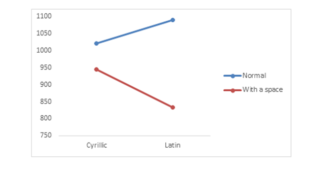
Analysis of variance showed that there is a statistically significant effect of lexicality on reaction time, which explains 8,5% of the variance. Pseudowords are processed faster than words. There is also a statistically significant effect of alphabet, but this factor explains only 0,1% of the variance of the total reaction time. Cyrillic words are processed faster than Latin words. Spacing also shows a statistically significant effect on processing speed and this factor explains 5,5% of the variance in total reaction time. A statistically significant interaction between lexicality and spacing was also obtained. The space between letters led to faster processing and shorter reaction time (fig. 3), where, as in the first experiment, a "stronger" effect of using this typographic feature was noticeable for pseudowords (251,95 ms (95% CI, 228,31 ms — 275,58 ms), p < ,001) than with words (88,39 ms (95% CI, 69,40 ms — 107,38 ms), p < ,001).
Table 3
Descriptive statistics measures of reaction time in relation to varied factors
Table 4
Results of analysis of variance
|
Factor |
F |
df |
P |
ηp2
|
|
Lexicality |
752,57 |
1 |
,000 |
,085 |
|
Alphabet |
7,204 |
1 |
,007 |
,001 |
|
Spacing |
476,57 |
1 |
,001 |
,055 |
|
Alphabet*Lexicality |
2,494 |
1 |
,114 |
,000 |
|
Spacing*Lexicality |
112,67 |
1 |
,004 |
,014 |
|
Alphabet*Spacing |
137,71 |
1 |
,003 |
,017 |
|
Alphabet*Spacing*Lexicality |
,853 |
1 |
,356 |
,000 |
As can be seen in Table 4, a statistically significant interaction between alphabet and spacing was also obtained. Spacing as a typographic feature speeds up processing in both Latin and Cyrillic (fig. 4), although the effect is more pronounced in Latin. Subsequent comparisons show that there is no difference in reaction time between Cyrillic words written normally and Cyrillic words written with spaces between letters (p > ,05). The findings partially confirm the initial assumption, but also indicate the existence of graphemic and visual differences between the two alphabets.
Discussion
In this research, typographic features and their influence on the speed of word processing in the Serbian language were studied, with a focus on comparing two alphabets - Latin and Cyrillic. Previous research showed that there are certain differences in the speed of processing two alphabets of the same language, and this research tried to expand the knowledge about their similarities and differences (especially on the visual level).
Typographic features are often used to improve the readability and understanding of the text, but they can also influence the increase of motivation and positive emotions when processing the material. For this research, two typographic features were selected, bolding and spacing between letters. In earlier research, on other languages, it has been found that they lead to positive effects when processing written text. By that, the hypotheses were set that bolding the words and creating spaces between letters would lead to the facilitation of answers in both the Latin and the Cyrillic alphabet.
The results of the first experiment show that bolding words speed up processing, regardless of the alphabet, which is in line with previous research (Baldwin, 2019; Pelesek, 2018) and confirms the hypothesis. This indicates that the visual emphasis of words made processing more efficient in both, Cyrillic and Latin. However, when it comes to the other typographic features, the results are slightly different. It was found that a larger space between letters speeds up word processing, but only in the Latin alphabet. For the Cyrillic alphabet, there was no statistically significant difference in processing speed between normal words and words with spacing between letters. This suggests that larger spacing between letters can improve reading and word processing in Latin, but that this advantage does not exist in Cyrillic. Such findings indicate that the letters of the Latin and Cyrillic alphabet differ in structure and visual complexity, which affects the way and speed of their processing.
Conclusions
This research provides important insights into the process of letter perception in the Serbian language. Bolding words can improve processing speed, while a larger space between letters has a positive effect only in Latin. These insights can be useful for designing better typographical solutions in school textbooks and other textual materials, to facilitate the process of reading and understanding the text in both letters.
References
- Blackwell, A. (2019). Visual representation. In: Soegaard, R.F. Dam (Ed.), The Encyclopedia of Human-Computer Interaction. Aarhus, Dansk: The Interaction Design Foundation.
- Borojević, S., Dimitrijević, S., Stančić, S. (2018). The role of grapheme characteristics on the processing of Latin and Cyrillic words. In: Proceedings of the XXIV Scientific Conference: Empirical Studies in Psychology (pp. 6—9).
- Borojević, S., Vračar, N. (2023). Using italic in two Serbian alphabets. In: Empirical Studies in Psychology, Book of Abstract (pp. 48). Belgrade: Faculty of Philosophy.
- Finkbeiner, R. (2021). Sprechakttheoretische Überlegungen zur Typographieam Beispiel von Presseüberschriften. Zeitschrift für germanistische Linguistik, 49(2), 244—291.
- Hagemann, J. (2013). Typographie und Textualität. Zeitschrift für germanistische Linguistik, 41(1), 40—64.
- Hyndman, S. (2016). Why Fonts Matter: a multisensory analysis of typography and its influence from graphic designer and academic Sarah Hyndman. Random House.
- Jaderberg, M., Vedaldi, A., Zisserman, A. (2014). Deep features for text spotting. In: Computer Vision–ECCV-2014: 13th European Conference, Zurich, Switzerland, September 6—12, Proceedings, Part IV, 13 (pp. 512—528). Springer International Publishing.
- Jarosch, J., Schlesewsky, M., Füssel, S., Kretzschmar, F. (2017). Taking typography to experimental testing: On the influence of serifs, fonts and justification on eye movements in text reading. Journal of Eye Movement Research, 10(6), 319.
- Macaya, M., Perea, M. (2014). Does bold emphasis facilitate e the process of visual word recognition? The Spanish Journal of Psychology, 17.
- Pašić, M. (2004). Uspješnost čitanja ćiriličnog i latiničnog teksta Success in reading Cyrillic and Latin text. Psihologija, 37(4), 495—505.
- Pelesk, M. (2018). Projektiranje portreta putem tipografije Designing portraits via typography (završni rad). Zagreb: Sveuciliste u Zagrebu, Graficki fakultet.
- Thiessen, M., Beier, S., Keage, H. (2020). A review of the Cognitive Effects of Disfluent Typography on Functional Reading. The Design Journal, 23(5), 797—815.
- Tešinović, J., Borojević, S., Dimitrijević, S. (2022). Does changing the font type affect the processing of Cyrillic and Latin words? Primjenjena psihologija, 15(2), 179—198.
- Wu, Y., Wang, Z., Lin, W., Ye, Z., Lian, R. (2021). Visual salience accelerates lexical processing and subsequent integration: An eye-movement study. Journal of Cognitive Psychology, 33(2), 146—156. https://doi.org/10.1080/20445911.2021.1879817
Information About the Authors
Metrics
Web Views
Whole time: 23
Previous month: 0
Current month: 23
PDF Downloads
Whole time: 2
Previous month: 0
Current month: 2
Total
Whole time: 25
Previous month: 0
Current month: 25